If you’re dreaming of a cream and gold kitchen that sparkles with elegance but still feels fresh (not stuck in the past), you’re in the right spot! I have three busy boys who think the kitchen is a playground, so my style has to balance beauty, warmth, and a little bit of chaos!
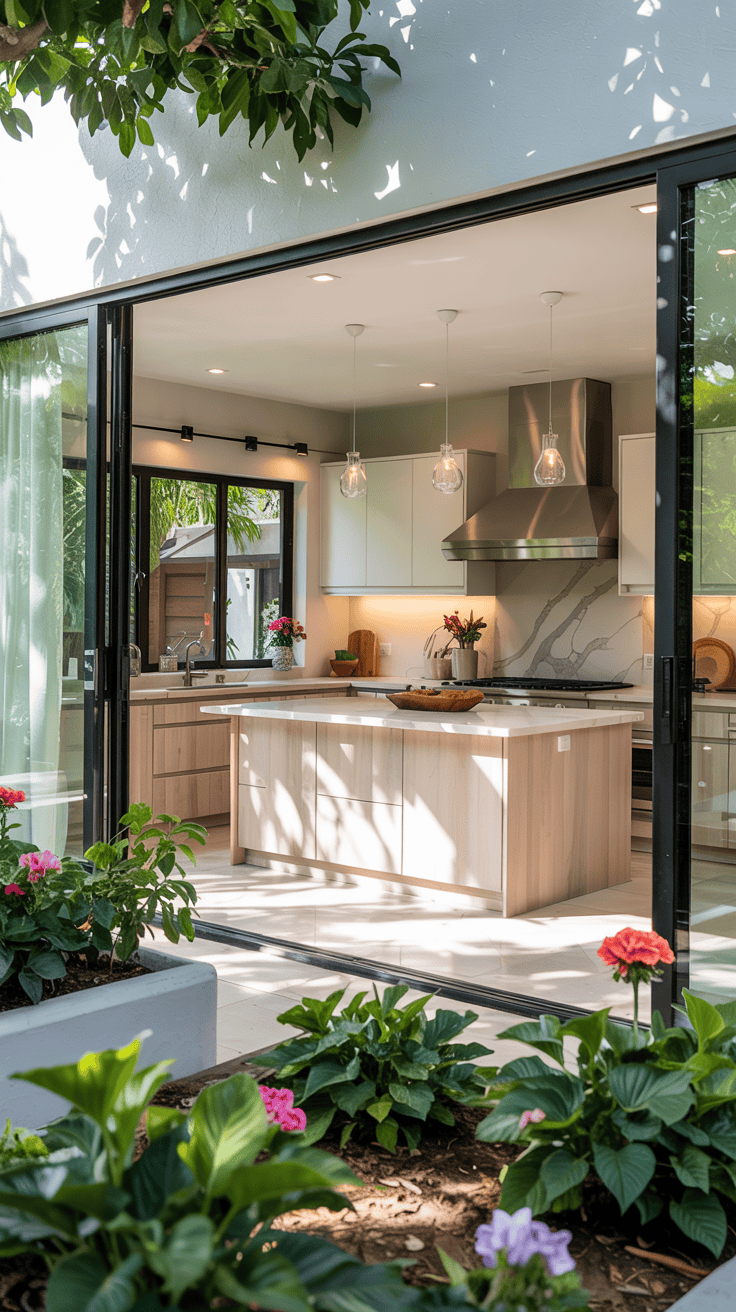
These details worked beautifully in our modern bold kitchen design!
I’m all about neutrals with a pop of glam, and these gold-accented kitchen pieces gave our cream kitchen just the right touch of elegance.
I wanted a space that’s both inviting for family time and lovely enough for me to enjoy that first cup of coffee in the morning. If you’re ready to make your cream and gold kitchen feel timeless, not tired, I’ve got the tips and tricks that actually work in a real, lively family home!

Why Cream and Gold Are the Ultimate Pairing for Modern Moms
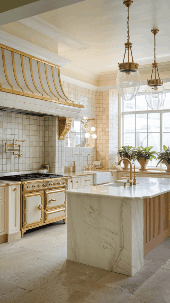
It’s no surprise cream and gold kitchens are showing up everywhere right now. Cream and gold kitchens just work for busy family homes like mine. I want spaces that feel warm and elegant, but never stiff or unfriendly.
Kids and pets run through, so style and comfort need to live side by side!
Let’s look at why this pairing stands out, especially for moms who care about more than just what’s trending on Pinterest.
Balancing Warmth and Sophistication

Cream is my secret weapon for making a kitchen feel cozy and lived-in. When my boys are tumbling around, cream is soothing. It doesn’t glare like bright white, and it hides smudges and fingerprints better than darker colors (which is not something you think about until you have sticky hands everywhere).


Gold accents, like drawer pulls, faucets, or a soft metallic backsplash, bring in a touch of polish. Not blingy, not loud… just enough shine to make the space feel a bit special. Here’s why the mix really sings in a family home:
- Cream keeps things soft. It makes even the biggest kitchen feel comfortable and welcoming.
- Gold adds a hint of luxury. Little touches of metallic make the whole room look more finished.
- It’s approachable yet elevated. I want a kitchen that I’m proud of, but that never feels “look but don’t touch.”
For families, this color scheme means you can create an environment that feels inviting and grown-up at the same time. When friends come over for coffee or a weekend breakfast, they always say my kitchen is both pretty and homey. That’s exactly what I’m going for!
Avoiding the Dated Look: What’s Changed?

We all remember those ‘80s kitchens with shiny brass and heavy cream cabinets, feeling a bit like your grandma’s fancy sitting room. Trust me, my goal is not to go back in time! Modern cream and gold kitchens are fresh, simple, and far from stuffy thanks to a few key changes:
- Matte and brushed gold finishes: Forget the mirror-shine brass. Brushed or satin gold hardware looks subtle, not flashy.
- Streamlined cabinet shapes: Instead of ornate or detailed cabinetry, think shaker doors or slab-front cabinets. Clean lines look current.
- Pair with organic textures: Add in wood, stone, or even woven lighting. This keeps the look grounded rather than overdone.
- Lighter, airier layouts: Today’s cream and gold kitchen usually includes more light and open shelving, which gives the space room to breathe.
- Mixing metals: You can have a cream and gold kitchen and still sneak in black, bronze, or nickel for a layered, collected look.
It’s these smart details that make cream and gold perfect for a modern, real-life home. My kitchen doesn’t feel like a movie set, but it still gives me that happy, “Wow, I really love this!” feeling whenever I walk in. And honestly, isn’t that what every mom wants?
Cream and Gold Foundations: Cabinets, Walls & Backsplashes
Let’s talk about what really sets the stage in a cream and gold kitchen. The right foundation makes all those gold accents shine, but it also has to work for your whole family. Every cabinet, wall, and backsplash needs to look good, stand up to sticky hands, and feel welcoming to everyone who walks in. I’ve learned so much as a mom surrounded by wild boys, spills, and non-stop action—so here’s what works and what will keep your kitchen looking fresh, not fussy.
Choosing the Right Cream Hue for Your Space

The cream color you pick sets the mood for the entire kitchen. Not all creams are the same! Some lean warm, and others feel cooler or more gray. In a cream and gold kitchen, the undertone and finish matter even more.
The best cream shade depends on your lighting and your home’s style:
- Bright, sunny kitchens: Try a creamy white with a soft yellow or ivory undertone. Natural light brings out the warmth and makes the kitchen glow. Benjamin Moore Simply White and Sherwin Williams Alabaster are two of my favorites.
- Darker spaces: If you don’t get a lot of sunlight, pick a slightly brighter cream. Choose one that won’t look dingy at night. I love Behr Swiss Coffee for these kitchens. It has a hint of richness that plays well with gold.
- Modern homes: Go for a cooler cream, almost greige but not quite gray. Sherwin Williams Greek Villa and Benjamin Moore Swiss Coffee both feel modern and fresh. These look stunning with brushed gold hardware and marble counters.
- Traditional or farmhouse kitchens: Warmer creams like Valspar Cream Delight add instant coziness. These creams make wood floors and rustic touches pop.
- Open concept spaces: If your kitchen flows into the living area, choose a cream with a neutral, balanced undertone. This helps everything feel pulled together.
A quick tip from my own experience: Always test samples on your walls at different times of day. Creams can look so different depending on the light. You don’t want any “oops!” surprises after all the painting is done.
For cabinets, stick to satin or semi-gloss finishes. They’re easy to wipe down (which you’ll be doing a lot) and give that subtle glow that makes gold really pop. For walls, an eggshell finish hides fingerprints but still feels soft and inviting.
Favorite cream paints that work in real homes:
- Benjamin Moore Simply White (warm, bright)
- Sherwin Williams Alabaster (classic and easygoing)
- Behr Swiss Coffee (a soft, true cream)
- Farrow & Ball Pointing (old-fashioned but not stuffy)
It’s amazing how the right cream can make your whole kitchen feel calm, open, and just a little bit magical.
Backsplashes That Make a Statement

When you build your cream and gold kitchen, the backsplash is the spot where you can have some extra fun! It’s right at eye level and makes a first impression for everyone walking in. Plus, let’s be honest, it gets splattered with everything from spaghetti sauce to finger paint.
Here’s what has worked in my kitchen, and what I recommend for other busy families who want some style without the headache:
Classic Marble with Gold Details
- Choose marble subway tiles or herringbone patterns for an elegant touch.
- Look for stone with warm veining or flecks of soft gold.
- If real marble worries you (because kids!), pick a porcelain tile that mimics marble but is easier to keep clean.
Glossy Subway Tiles
- Creamy, glossy tiles reflect light and are easy to wipe down.
- Add a row of metallic gold accent tiles as a border or in a fun pattern. It’s subtle but brings in just the right amount of shine.
Brushed Gold Grout
- Level up plain white or cream tiles with a hint of sparkle using gold-hued grout. It brings the gold theme to your backsplash without being over-the-top.
- This works best with hexagon or mosaic tiles for that little pop of color between each piece.
Textured Glass Backsplashes
- Glass tiles in ivory or pearl with a gold shimmer are tough and stain-resistant. Good for messy cooks (like me!) who want a fancy look but need something wipeable.
- Mosaic sheets let you mix in bits of gold for a “wow” effect that the kids notice, but it never feels busy.
Patterned or Moroccan-Inspired Tiles
- If you want personality, try a patterned tile where the design mixes cream, white, and bits of gold.
- I like using these as a stove nook backsplash or behind open shelves as an accent.
Here’s what to keep in mind for family kitchens:
- Always pick materials that wipe clean with just a sponge and some soap.
- A little gold goes a long way. One row or a few accent tiles can add sparkle without going overboard.
- Seal grout lines well if you have tile. This keeps things looking fresh no matter how many times you clean up spaghetti splatters!
Breathe a little life into classic cream with backsplashes that make the space yours. The mix of gold details and durable finishes means you get both beauty and function… which every mom appreciates!
The Art of Using Gold Accents Without Overdoing It

A cream and gold kitchen can feel warm and fresh, with a little bit of sparkle—but getting those gold accents right is what really brings everything together. Too much gold can make things feel flashy and overdone. Not enough, and you might miss that special, elevated touch. I’ve found it’s all about balance, especially in a busy family kitchen like mine. Here’s how I keep our cream and gold look stylish, practical, and totally livable… even with three boys running wild!
Favorite Gold Hardware and Fixtures for Busy Families
Every mom knows the real test for kitchen hardware is how it survives sticky fingers, spill disasters, and constant cabinet slamming. I always look for hardware and fixtures that can stand up to the mess while still looking amazing.
Here’s what works best:
- Brushed gold drawer pulls and handles: I love brushed gold because it hides fingerprints and looks soft, not shiny. Long bar pulls are easy for kids to grab, and they’re simple to wipe clean.
- Satin brass knobs: These give a classic look and don’t show every little smudge. I keep a pack of baby wipes in the drawer for a quick swipe!
- Easy-to-clean gold faucets: Matte or brushed finishes on faucets are lifesavers. Go for solid brass construction with a durable PVD (Physical Vapor Deposition) coating. It’s fancy-sounding but just means the finish won’t chip or fade. I have a pull-down spray faucet, and it has survived years of “water fights” at my sink.
- Gold light fixtures: Pendant lights in brushed or satin gold look dreamy but aren’t high-maintenance. Simple dome or globe shapes are less likely to trap dust and easier to clean. Stay away from fixtures with tons of tight, tiny details because wiping every groove is just another chore.
- Gold cabinet latches: These add a bit of old-school cottage charm and are way sturdier than you’d think. My youngest tugs hard, and nothing has bent yet.
When shopping for these pieces, always pick hardware that feels solid in your hand—not something lightweight or hollow. That heft means it’s probably made to last, which is exactly what you need for family life.
My go-to brands for durable gold hardware and fixtures:
- Amerock and Liberty (for pulls and knobs)
- Delta, Moen, or Kraus (for faucets—many offer spot-resistant finishes)
- Kichler or West Elm (for light fixtures)
A quick tip: buy a couple of extra knobs or pulls. Accidents happen, and you’ll thank yourself later when you can swap out a broken one without hunting for a match.
Mixing Metals for a Contemporary Touch

You don’t want your cream and gold kitchen to look like you dipped everything in glitter. Too much gold can read tacky fast. That’s why I always mix it up with other finishes for a more relaxed, updated style.
Mixing metals isn’t just pretty—it’s practical, too! Most appliances come in stainless or matte black, so you want your finishes to feel intentional. Here’s my cheat sheet for a balanced look:
- Stick to one main metal: I let gold be the star for cabinet hardware and light fixtures. Then, I weave in smaller amounts of stainless, matte black, or brushed nickel. That way, nothing fights for attention.
- Let appliances stay stainless: Don’t stress about matching your fridge and stove to your hardware. Stainless steel is nearly impossible to fight with. Cream cabinets and gold pulls look great next to cool-toned appliances.
- Try a statement faucet in matte black: If your hardware is gold, a matte black faucet looks striking and modern but doesn’t overpower the space.
- Layer in brushed nickel accents: Brushed nickel pairs well with both gold and stainless. I use nickel outlet covers or switch plates, so the metallics blend instead of clashing.
- Use black in small doses: A few black metal stools, shelf brackets, or a bold black clock can help anchor your space. Black is great at keeping things from feeling too sweet or precious.
- Repeat metal finishes around the room: For example, if you’ve got gold knobs and a gold pendant, add a gold-framed piece of art or a gold utensil holder somewhere else. It keeps things connected.
- Avoid mixing more than three different metals: Otherwise, it gets messy fast. Two is perfect for most kitchens.
Here’s my real-life formula for a cream and gold kitchen:
- Gold cabinet pulls and pendant lights
- Stainless appliances and a stainless trash can
- A black faucet or black metal barstools
It pulls together without feeling forced, and my friends always say it looks like a designer picked everything out (but really, it was just a few smart choices).
Little things I remember:
- Don’t fuss if all your golds aren’t a perfect match. A mix of satin and brushed textures actually looks better together. Perfection isn’t the goal!
- If you’re nervous, start with just a few gold accents and add a little more over time.
- Add a metallic tray or fruit bowl if you want to try out new finishes without installing anything.
Mixing metals the right way means your cream and gold kitchen always feels fresh, never frumpy. It’s the secret to making a space look collected and welcoming—just the vibe I want for my family and everyone who pops by.
Styling Tips for a Cozy Yet Elegant Cream and Gold Kitchen
When you create a cream and gold kitchen, it’s all about making your home feel inviting while still showing off a bit of style. I want the space to feel soft, but not boring; pretty, but not fussy. I’ve learned (with three boys running wild) that you don’t have to give up style for practicality. Cozy doesn’t have to mean cluttered, and elegant doesn’t have to feel cold! Here are my favorite ideas for designing a kitchen where family life feels good, and elegance shines in everyday moments.
Family-Friendly Decor that Doesn’t Sacrifice Style

Real family kitchens need to keep up with all the daily mess and action. That doesn’t mean we just toss beauty out the window. I love finding those little touches that make my cream and gold kitchen not only work for real life, but actually sparkle a little too. Here’s how I pull it off:
- Baskets and bins for stashing stuff: Woven baskets in natural tones look great on open shelves and keep the chaos in check. I toss everything from mail to granola bars in them. Try a mix of shapes for a casual look.
- Pretty, practical dishware on display: I love open shelves for stacking cream plates or soft gold-edged bowls. They look elegant but are easy for kids to grab. A simple white cake stand on the counter adds height and gives space for fruit or muffins.
- Art that tells your family story: Bring in a framed kid painting or a sweet vintage print with gold accents. Even a favorite quote can get a glow-up with a gold frame. These little touches make the whole kitchen feel personal and warm.
- Glass jars & canisters: Use clear jars for snacks or pasta, with simple gold or wooden lids. It keeps everything in sight and feels clean, not cluttered.
- Cute cutting boards: I lean wooden cutting boards against the backsplash. Layer a few sizes and shapes—they double as both decor and handy tools.
- Practical but pretty utensils: Fill a gold-tone or cream ceramic crock with wooden spoons, whisks, and spatulas. It’s kitchen art that actually gets used every day!
These small changes invite my family to join in but don’t mess up the cream and gold kitchen vibe. You can tidy up in two minutes but still sit down and admire how pretty everything looks.
Adding Texture for Depth and Comfort
A cream and gold kitchen is gorgeous, but if everything is flat and smooth, the room feels stiff. It needs layers and a little bit of softness to really feel like home. I work in lots of cozy texture, so the whole kitchen feels inviting—even when nobody is baking cookies! Here’s what I use to add depth and keep things from looking like a showroom:
- Wood accents: Wood brings instant warmth. Try open shelves in a natural finish, a wooden bowl on the island, or a rustic table paired with modern gold chairs. If you have wood floors, let their grain show—it grounds the whole space.
- Woven touches: A rattan tray, bamboo shades, or woven placemats add a laid-back vibe. You don’t need many—just one or two in the right spots does the trick. I like a seagrass rug by the sink because it dries fast and hides spills.
- Ceramics and pottery: Think chunky cream mugs, a handmade platter, or a vase with big, blousy flowers. Stashing a few of these pieces on shelves or the counter softens all those shiny gold edges.
- Soft linen towels and curtains: Linen dish towels in cream or pale blush add a gentle feel. Swapping out heavy curtains for sheer panels makes the space airy and bright. If you hang them high, your windows look even taller!
- Metal with personality: Not everything needs to match. Brass, soft gold, even a little bit of black or brushed nickel can add energy and keep things relaxed.
If you want your cream and gold kitchen to look collected, not cookie-cutter, don’t be shy with texture. The best part? All these touches double as kid-friendly, so I never worry about things getting too precious.
By mixing cozy layers with beautiful details, my kitchen feels just right for family movie night, baking messes, and the quiet cup of coffee I treat myself to when the house is (almost) still.
Mistakes to Avoid When Designing a Cream and Gold Kitchen

When you’re planning a cream and gold kitchen, it’s easy to get caught up in the excitement and make decisions that sound pretty in your head but feel off in real life. Speaking as a mom of three boys (who treat the kitchen like an obstacle course), I’ve seen how fast a good idea can turn into a head-scratcher. The cream and gold kitchen trend is gorgeous, but a few missteps can make it look less “warm, elegant family hub” and more “retro overload” or “mess magnet you regret.” I’ve rounded up the top mistakes, so your kitchen makeover turns out as dreamy in real life as it does in your imagination!
Using Too Much Gold Everywhere
Gold is beautiful. Trust me, I love sparkle, but it’s easy to go overboard. Pouring gold into every corner of your cream and gold kitchen can start to feel like you live inside a jewelry box. The last thing any mom wants is a space that feels too fancy for spaghetti night or laughs with kids.
The fix:
- Limit gold to hardware, lighting, and one or two accent pieces.
- Keep big surfaces and cabinets in soft, warm cream.
- Let gold act as a highlight, not the main color.
- Think of gold as a sprinkle of cinnamon on a latte… not the main ingredient!
I always remind myself that shine is meant to catch the eye, not blind it. Too much, and it just looks forced. If the room starts to feel more like a display case than your family’s favorite hangout, pull back.
Picking the Wrong Shade of Cream
Cream seems simple, right? It’s actually one of the trickiest colors. Too yellow and it feels old-fashioned. Too white and it looks cold or boring next to gold.
How to avoid this mix-up:
- Test samples in your kitchen’s lighting before fully committing.
- Watch for undertones. Cool undertones (grayish) feel more modern, while warm undertones (peach or yellow) lean traditional.
- Match your cream to your home’s style and the natural light you get throughout the day.
I learned this the hard way! I once painted my cabinets a “buttery cream” that looked gorgeous at the paint store but turned out weirdly neon in my kitchen’s morning light. It clashed with the gold and drove me nuts. Always paint big swatches and look at them at breakfast, lunch, and evening with the lights on.
Making Gold the Only Metal in the Room

Some people think you need to match every bit of metal. That’s not true for a cream and gold kitchen. If every handle, faucet, and fixture is gold, the room can feel stiff and dated.
How I’ve found balance:
- Mix in black, stainless, or brushed nickel for variety.
- Use gold as the main accent, but let other metals appear on stools, light fixtures, or appliances.
- Don’t stress if metals aren’t the exact same shade.
My dishwasher is stainless, my cabinet handles are gold, and I toss in a matte black wall clock. The mix feels collected, casual, and totally family friendly.
Overdoing Old-School Details
Heavy trims, ornate cabinet doors, and shiny brass can make a cream and gold kitchen feel stuck in the past. I want charm, not a throwback to grandma’s formal dining room. Busy designs and lots of shiny gold will date the space.
What I recommend:
- Choose shaker or flat-front cabinets for a clean look.
- Stick to simple, modern hardware shapes.
- Pick brushed or matt gold, not bright, mirror-polished finishes.
- Pair with natural wood and simple lines.
If you want a little vintage vibe, add one piece like a gold-framed mirror or a sweet antique tray. Just don’t wrap the whole kitchen in layers of frills and scrolls.
Skimping on Practicality for the Sake of Looks
Some cream and gold kitchen ideas look gorgeous in magazines but flop in a real home with food, family, and the everyday mess. Cream floors that stain, intricate backsplashes that are impossible to wipe, or gold faucets that spot if you even look at them the wrong way are trouble waiting to happen.
Here’s what works for busy families:
- Pick cream paint with an easy-clean finish (satin or semi-gloss for cabinets, eggshell for walls).
- Choose hardware that doesn’t show every fingerprint.
- For backsplashes, use simple, easy-to-clean materials; skip grout-heavy designs if you hate scrubbing.
- Look for gold finishes with spot-resistance and durability. Some brands even label their products as family or “lived-in” friendly!
If I can’t wipe it down in under a minute, it doesn’t belong in my kitchen. I’d rather have less wow factor than spend my life cleaning.
Ignoring Texture and Layers

Cream and gold on their own can feel flat if you forget about texture. The wrong design choices can leave the space looking too sterile or too “matchy-matchy.”
What brings it to life:
- Add wood open shelves, woven baskets, or textured ceramics.
- Mix matte with glossy finishes, like a glossy tile backsplash and brushed gold hardware.
- Layer in soft textiles and greenery, not just cream and gold everywhere.
Texture keeps the space cozy and welcoming even when it’s spotless. It also camouflages all the little dings and crumbs from family life!
Forgetting to Seal and Protect
This one’s not glamorous, but it’s essential! Cream cabinets and gold finishes need protection from all those sticky hands and spaghetti splatters. Skipping this step leaves you dealing with chips, wear, and permanent stains.
Simple steps to avoid disaster:
- Seal painted cabinets with a high-quality topcoat.
- Make sure your gold hardware and faucet have a strong, modern sealant.
- Reseal grout and stone yearly if you use them for backsplashes.
A little prep work at the start saves a lot of tears later. My youngest once dropped a spaghetti-covered fork down a lower cabinet… if I hadn’t sealed it, I’d have a permanent orange streak!
Not Thinking About Lighting
A cream and gold kitchen can look dreamy… or dingy… depending on how you light it. The wrong kind of lighting makes cream look flat and gold look harsh.
What I swear by:
- Mix warm and neutral LED lights for a soft, welcoming glow.
- Add under-cabinet lighting to show off backsplashes and make gold shine.
- Avoid cold blue or extreme white bulbs that can ruin the warmth of both colors.
If you haven’t updated your lighting in years, it’s an easy fix that makes the whole kitchen feel new again!
Letting Trendy Take Over

I know how tempting it is to grab every “hot” item you see on Instagram. But if you chase trends too hard, you’ll end up with a kitchen you don’t love next year.
Here’s my mom-to-mom advice:
- Stick with timeless basics for cabinets, layout, and foundation pieces.
- Use trendy gold decor or small accessories so you can swap them out when styles shift.
- Listen to what feels right for your family… not just what’s in a glossy photo.
What works for someone else might not work for you (especially with wild kids). Stay true to your taste!
The Quick List: Keep Your Cream and Gold Kitchen Beautiful
I know kitchen projects can get overwhelming, so here’s a fast cheat sheet of common mistakes to avoid:
- Using gold everywhere and making the space too shiny.
- Picking the wrong shade of cream for your light and style.
- Only using one metal and ignoring the rest.
- Going heavy on old-fashioned details and hardware.
- Choosing looks over easy-to-clean surfaces and finishes.
- Forgetting fun textures, which make the room feel lived-in.
- Skimping on topcoats, sealants, and upkeep.
- Settling for boring or harsh lighting.
- Chasing trends instead of lasting comfort and charm.
Learning from others means you get straight to the good parts of your cream and gold kitchen—warmth, beauty, and everyday fun—without the headaches. I want your kitchen to be a space where everyone gathers and you always feel at home!

Conclusion
A cream and gold kitchen can be both elegant and family-friendly, and I promise you, it’s possible to pull off this look in a busy home! With the right cream shade and just the right touches of gold, you get a space that feels fresh, warm, and special every single day. I’ve watched my own three boys turn our kitchen into their favorite hangout, and somehow, it still makes me smile each morning when I walk in.
Remember, the beauty is in the balance. Don’t worry about keeping everything perfect or matching every detail. My favorite finishing touch is a vase of fresh flowers on the counter, even if they’re just from the grocery store. It makes the whole room pop and reminds me to soak up the happy, messy moments. You can create a cream and gold kitchen that feels just right for your family. Thanks for joining me on this journey! If you want to share your own ideas or finishing touches, I’d love to hear all about them.
This post may contain affiliate links. Read the full disclosure here.